How to Make a Wedding Look Classy?
Dec 17th 2025
How to Make a Wedding Look Classy?
Putting together a wedding that feels timeless and classy is about focusing on quality, cohesion, and thoughtful details. From invitation design to table styling, every element should support a refined aesthetic. One detail that often makes a strong impression without breaking the budget is the choice of invitation, specifically thermography wedding invitations. In this guide, you’ll learn practical tips to elevate your wedding look with elegant choices and cohesive styling.
Introduction: defining classy in wedding design
Classiness isn’t about overdoing it; it’s about restraint, quality materials, thoughtful typography, and a harmonious color palette. Thermography wedding invitations can set the tone for the entire event, signaling a sophisticated approach from the very first impression. By selecting invitations that reflect your wedding’s theme and practical considerations, you create a cohesive foundation for the day.
Section 1: Establishing a cohesive color palette
Color is one of the most powerful levers in achieving a classy aesthetic. For a timeless look, consider these approaches:
- Neutrals with a touch of metallic: ivory, champagne, alabaster, and soft gray paired with gold or rose-gold accents.
- Monochrome elegance: varying shades of a single color (e.g., navy, charcoal, and white) for a refined, layered effect.
- Soft pastels with contrast: blush, sage, or powder blue with deeper accents like charcoal or black for balance.
When planning thermography wedding invitations, choose a color for the text and embellishments that complements your palette. Thermography (raised-print) invites the eye and touch with subtle texture, adding an understated luxury without overwhelming the design.
Section 2: Invitations that set the tone
Invitations are a prelude to the wedding atmosphere. For a classy look:
- Select a high-quality paper stock with a tasteful weight and finish.
- Favor simple typography over overly decorative fonts; think serif or clean sans-serif with generous letter spacing.
- Use spacing and margins to create a clean, breathable layout.
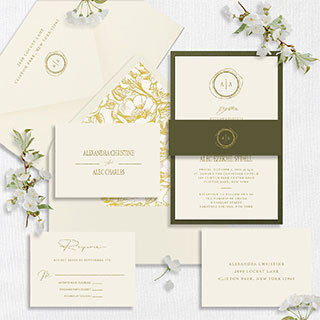
- Consider thermography wedding invitations as an elegant alternative to engraving or letterpress, offering an elevated feel with a distinct raised texture.
Thermography provides a refined, vintage-inspired texture that reads as upscale without the cost of more intricate print methods. When ordering invitations, ask your stationer to show you samples of different textures and how they feel to the touch. The tactile element is crucial to conveying class.
Section 3: Venue and décor cohesion
Classy weddings often shine through cohesive styling across venue, décor, and attire:
- Pick a unifying motif that appears in invitations, menus, and signage.
- Choose tableware and linens in colors that echo the invitation palette.
- Use florals and greenery to create an elegant, natural backdrop rather than overpowering settings.
- Lighting matters: soft amber or daylight-balanced fixtures can transform spaces into warm, sophisticated environments.
Your thermography wedding invitations should harmonize with boutonnières, place cards, and programs. A consistent look reinforces a classy vibe from invite to farewell.
Section 4: Attire and personal touches
Attire is another pillar of sophistication:
- For the couple, classic silhouettes and tasteful accessories never go out of style.
- For guests, provide guidance that helps maintain the aesthetic (e.g., a dress code that leans toward formal or semi-formal).
- Personal touches, such as a monogram on paper goods or a small, elegant keepsake, can deepen the sense of refinement.
Tie the invitation design to the wedding party’s attire. If your thermography wedding invitations feature a particular font or emblem, consider incorporating that motif into your ceremony programs or seating cards for a polished, unified presentation.
Section 5: Details that whisper luxury
The smallest details often deliver the biggest impact:
- Ribbon choices, envelope liners, and wax seals can elevate invitations without becoming overpowering. If your budget allows, opt for high-quality wax seals or metallic foil accents sparingly.
- Consider envelope color that complements the invitation stock; a slightly tinted envelope can add a refined touch.
- Menu cards, place cards, and programs should maintain the same typographic style and color palette as the invitations.
Thermography wedding invitations can be the anchor for your design system. Their tactile raised printing communicates attention to detail and a commitment to quality that resonates throughout the wedding experience.
Section 6: Budget-conscious strategies for a classy look
Classy doesn’t have to mean extravagant. Smart strategies include:
- Invest in the key pieces: a few high-impact elements (like thermography wedding invitations) combined with well-chosen décor that echoes the invitation design.
- Use neutrals and natural materials (wood, stone, linen) to achieve elegance without heavy ornamentation.
- Repurpose florals and décor from the ceremony to the reception to maximize impact.
When you allocate resources toward a few focal points, you create an impression of sophistication that feels effortless rather than purchased.
Final thoughts
Achieving a classy wedding look is about harmony, quality, and thoughtful detail. Begin with invitations that set a refined tone, such as thermography wedding invitations, to anchor your design language. From there, extend that language through cohesive color palettes, coordinated décor, and understated luxury touches. By prioritizing texture, typography, and tactility, you can craft a wedding experience that feels timeless, elegant, and distinctly you.


